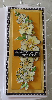
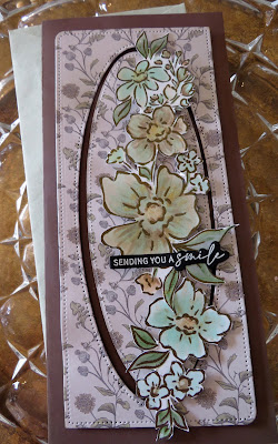
Happy Sunday! I have been anxious to share these cards, but now I am not sure I am ready or qualified. I was waiting for the 'glare' to go away so I could photograph the cards, but I got anxious and did some 'teaser' photos! Hope you enjoy.
So, notice the Pinkfresh studio 'floral notes' stamp and yes, layering stencils. Awesome!
Looks pretty straightforward. Stamping, stenciling or coloring. I used copics for the coloring the yellow flower. | ||
'you are the sweetest'sentiment is in the stamp set.
Showing the Pinkfresh studio stamp, and stencil set. Notice the nice sentiments with the pretty script. There is a die for the flower & stencil set.
The two cards were stamped as one stamp, cut apart and I used the stencils and pinkfresh ink for color. The grid die is from Ali express. Just extra pieces from the turquoise flowers.
Now the next ones are colored with the Underpainting technique from Vanilla arts. Please go to the site and watch Amy Schultes tips and classes. This is new to me, because of that, I am dying to share with you. Remember I am a REAL beginer!! Thats like buying a box of copics and only taking one class/ or no class and thinking you can teach it. Actually I did get certified to teach copics with one class, and a teacher that talked about her boyfriend. it was probably10 years ago, but no one in that class deserved to be certified, as she didn't look at anyone's work. Collected her $120.00. There are fabulous teachers online and Amy Schulte has a unique view of color.
Lots to explain here! So I did the underpainting with a copic marker. I followed the Vanilla Arts Combo for the Dawn gold. I picked the combos which I was certain I had all the markers. Then I underpainted with Blue violet!! Who would guess. Then the shading was applied in 3 yellows. Again I loved it, BUT Amy Schulte says to look at each petal of a flower and how its color affects the next color. I am sure I was just jazzed to watch the results!This flower is pretty open with very little accented petals, so it was too easy to just apply a base overall. That is not what Amy intended! The moisture is what allows the ink to blend, not the color. So doing one area at a time slowly would have been nicer.
Love the colors, but honestly can't remember what I used. Again, I am still working to fast, not enough detail. Scan what you do! I hate a notebook ...lots of kid images and flowers. Really nicely copic colored. If you scan and write the colors used, you can make another card real fast. My cards go to different places so I repeat sometimes. Sun was on it, but I copied some of the combos from Vanilla Arts.
This one turned out to be a favorite, but I still can't believe it started with the YG06! I had a hard time with that and pink. Yes, in the flower. I added white colored pencil on top & didn't like that, so see, I really need a class! Called Peony Punch..
Next one is Rose Sorbet with a B41 base & E's!
This is all for now, there is more I promise. Amy Schulte uses her prismacolor pencils for a push/pull effect. Yes, over the copics. So much to learn... Go to vanillaarts.com and enjoy!
Thanks for looking!
Mary


No comments:
Post a Comment